Since the storyline of A Realm Reborn is coming to a close, I figured it’d be nice to reminisce and look at the various logos we’ve seen of Final Fantasy XIV throughout the years (and subsequent months post-ARR’s release).
Of the 2.x patches, I have to say that my favorite logo of the bunch has to be Dreams of Ice. Parts of it reminds me of the low fidelity NES/Famicom Final Fantasy logo renderings with Amano artwork, as well as looking very closely to an Amano inspired logo art as you can get.
What’s your favorite of the bunch?
Heavensward will always be the best logo.
Dreams of Ice is my absolute favorite.
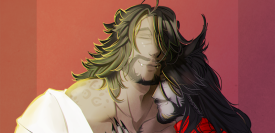
Final Fantasy XIV Logo Artwork from Patch 3.1 to 4.2
Worth noting here is how the patch artworks that conclude the Dragonsong War storyline (Patches 3.1, 3.2, and 3.3) all feature a muted color palette and the same font for their logos. This font is in the same font family to the A Realm Reborn font, as well as the one used in the logos for Dreams of Ice (Patch 2.4) and Before the Fall (Patch 2.5).
Starting with Soul Surrender, the patch artworks tend to favor a more vertical design, akin to Final Fantasy XII’s logo. However, smaller cropped versions exist – mostly for use in social media.
If you also look at 4.1 and 4.2, the artwork focuses on the side content, so 4.1 is the 24 man raid (Rabanastre/Ivalice) and 4.2 is Omega Sigmascape.